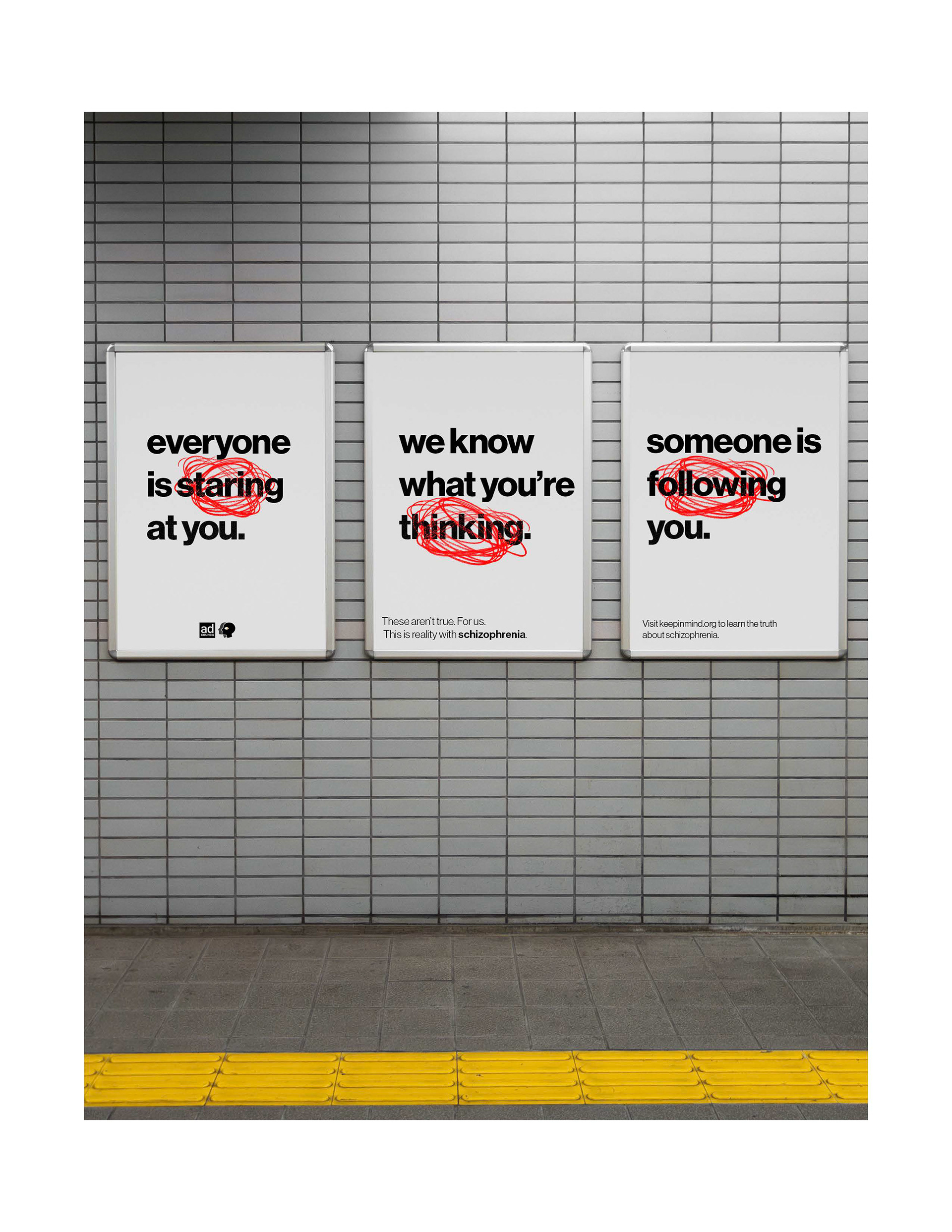
For my advertisement design class, we were tasked with creating a series of public service advertisements for a topic of our choice. I decided to go with a misunderstood and stigmatized illness, schizophrenia. Here, you can see my process in how I got to my final products; a website landing page, a guerrilla advertisement, an Instagram carousel, and the finalized poster. All of course using the typography, color scheme, logo and elements that we came up with.
I didn't have a clear aesthetic direction so I decided to start sketching, not really paying attention to one more than the other. I made two poster designs, and a logo design. I wasn't entirely happy with them, but it was a start.


I continued to build on those ideas and eventually had the idea to create a logo using elements from the first poster design. I decided on the name "Keep In Mind" as wordplay relating to the symptoms and stigma around schizophrenia.


I liked the stark red as the only color, so with that I decided to take another stab at the poster with that as my focus.
It ended up being the main theme I wanted to go for, but I wanted it to look a little bit more chaotic, so I decided to incorporate handwriting. And with that, I went straight to the other deliverables, and got my final series.